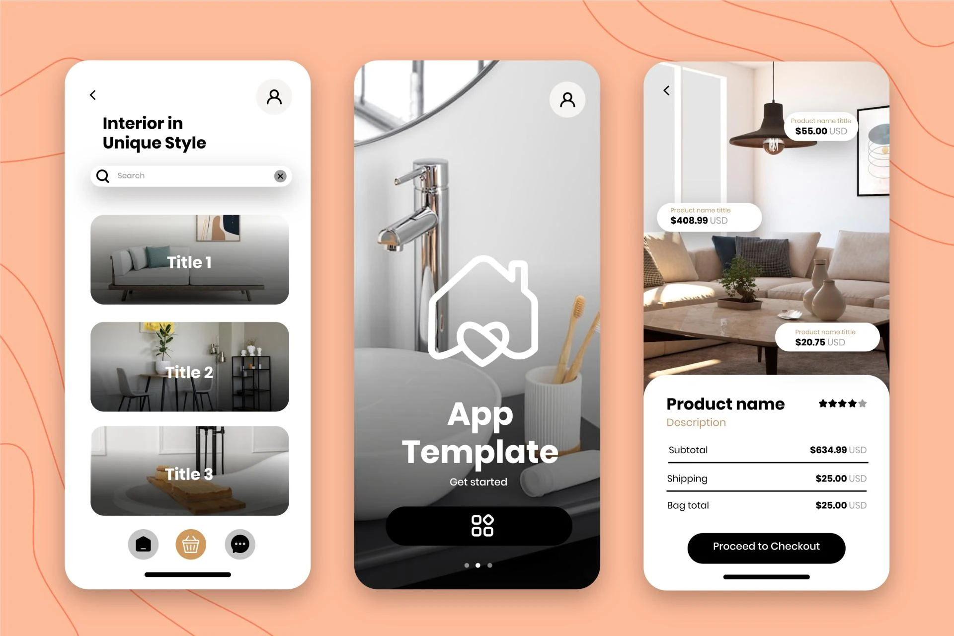
In today's digital landscape, where users access websites from a myriad of devices – ranging from desktop computers to smartphones and tablets – designing adaptive and responsive experiences has become paramount. Responsive Web Design (RWD) is a design philosophy that aims to create websites that seamlessly adjust and optimize their layout and functionality across various screen sizes and resolutions. By embracing RWD, developers and designers can ensure that their websites provide an exceptional user experience, regardless of the device being used.
The Rise of Mobile-First Design
The proliferation of mobile devices has fundamentally reshaped the way we interact with the web. As consumers increasingly rely on their smartphones and tablets for browsing, shopping, and consuming content, the need for mobile-friendly websites has become a necessity rather than a luxury. Mobile-first design, a core principle of RWD, prioritizes the mobile experience by designing and developing websites with smaller screens in mind first, before scaling up to larger displays.
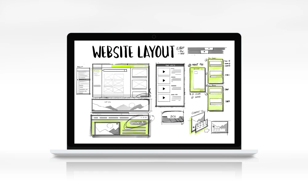
Fluid Grids and Flexible Layouts
At the heart of RWD lies the concept of fluid grids and flexible layouts. Traditional fixed-width layouts were designed for desktop browsers, resulting in horizontal scrolling and suboptimal experiences on smaller screens. With fluid grids, the layout elements resize and rearrange dynamically based on the available screen real estate, ensuring that content is legible and easily accessible across devices.
Flexible Media and Responsive Images
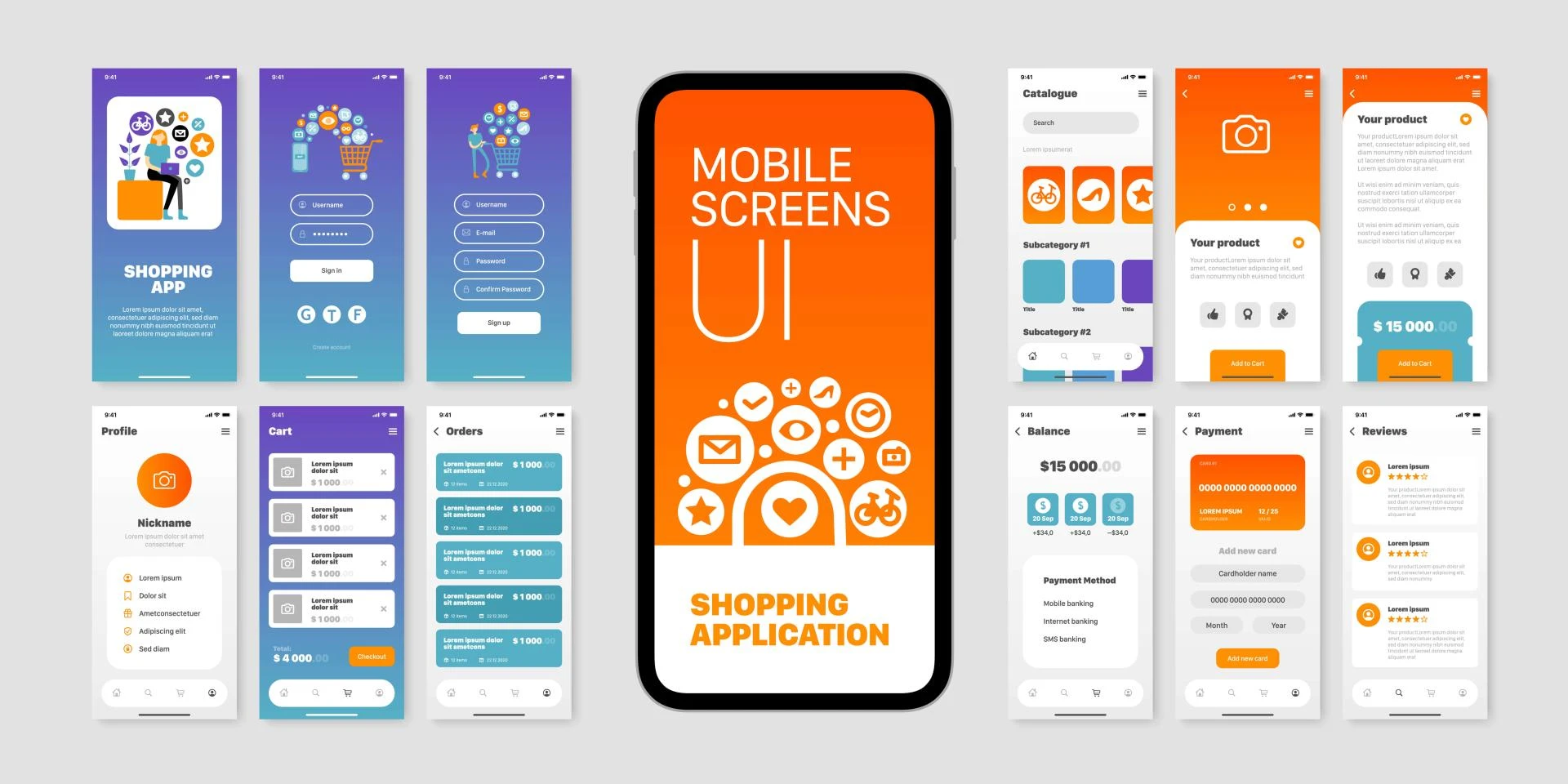
In addition to fluid grids, responsive websites must handle media elements, such as images and videos, in an intelligent manner. Responsive images adapt their dimensions and resolutions based on the device's capabilities, ensuring that high-resolution images are delivered to high-density displays while optimizing file sizes for slower network connections. This approach not only enhances the visual experience but also improves page load times, a critical factor in user engagement and search engine rankings.
Breakpoints and Media Queries
Breakpoints are predefined screen sizes at which a website's layout and styling adjustments occur. Media queries, a powerful feature of CSS3, enable developers to apply different styles based on the device's characteristics, such as screen resolution, orientation, and aspect ratio. By leveraging media queries, designers can create multiple layout variations tailored to specific device types and screen sizes, ensuring a consistent and optimal experience across the board.
Typography and Readability
Responsive typography is a crucial aspect of RWD, as text legibility and readability can significantly impact the user experience. Responsive websites employ techniques like fluid typography, where font sizes and line heights dynamically adjust based on the screen size, ensuring optimal readability across devices. Additionally, designers must consider factors like line length, contrast, and font choices to enhance the overall reading experience.
Performance and Accessibility
While crafting responsive experiences, it's essential to consider performance and accessibility. Responsive websites should load quickly, even on slower network connections, by optimizing assets, leveraging caching, and implementing performance best practices. Additionally, adhering to accessibility guidelines, such as providing alternative text for images and ensuring proper keyboard navigation, ensures that the website is inclusive and usable for individuals with disabilities.
Testing and Optimization
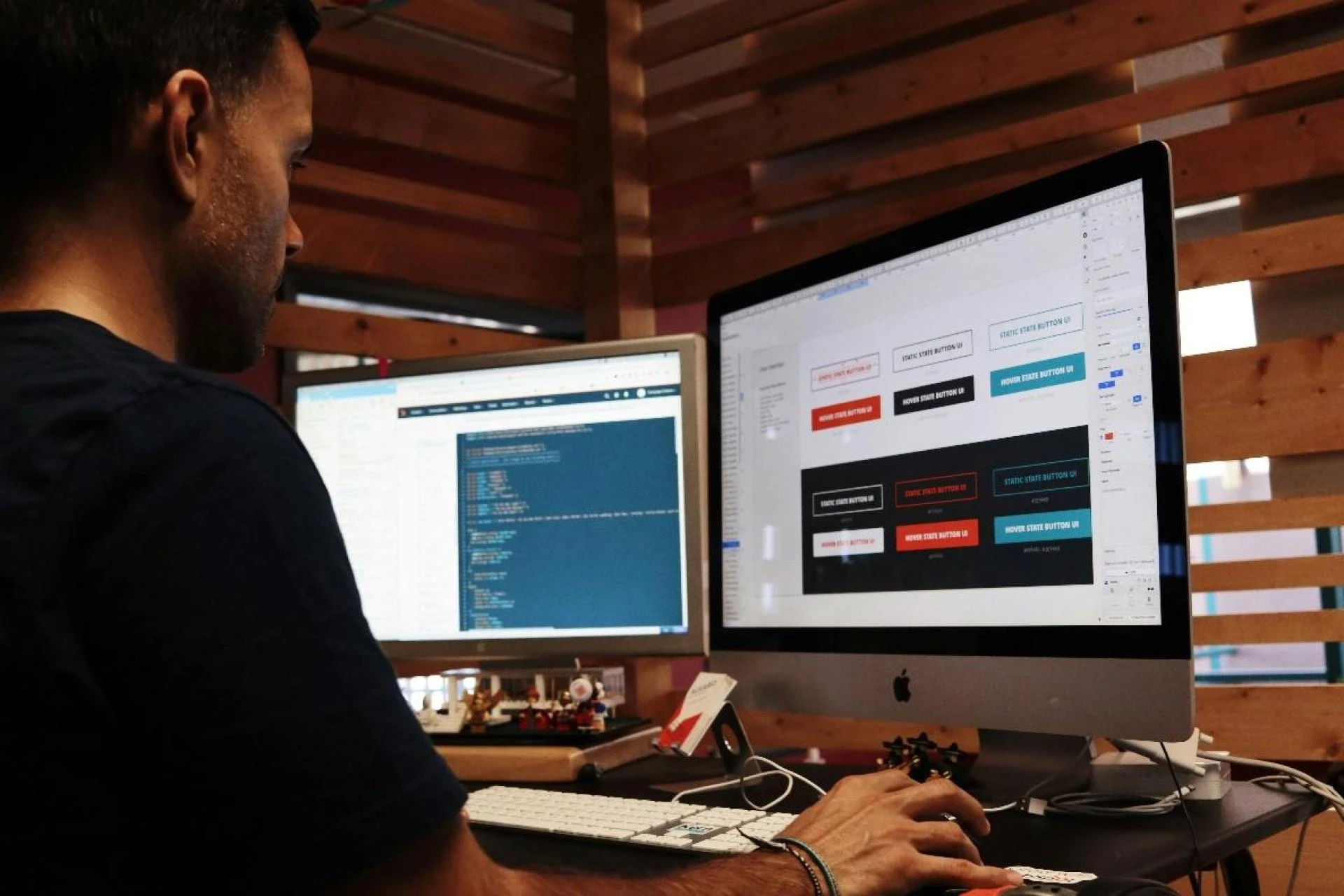
Responsive design is an iterative process that requires thorough testing and optimization. Developers and designers must test their websites across a wide range of devices and screen sizes, identifying and addressing any layout or functionality issues. Tools like browser developer tools, emulators, and remote debugging tools can aid in this process. Additionally, regular performance audits and user feedback can help refine and improve the overall responsive experience.
The Future of Responsive Design
As technology continues to evolve, the principles of responsive design will become increasingly important. With the emergence of new form factors, such as foldable devices and wearables, designers and developers must stay ahead of the curve and adopt a future-proof mindset. Embracing modular design approaches, progressive enhancement, and emerging web standards will be crucial in delivering seamless and adaptive experiences across diverse platforms.
Conclusion
Responsive Web Design is no longer an option but a necessity in today's multi-device world. By crafting adaptive experiences that seamlessly adjust to various screen sizes and resolutions, developers and designers can ensure that their websites remain accessible, engaging, and user-friendly across the ever-expanding digital landscape. Embracing RWD principles, such as fluid grids, flexible media, and responsive typography, while prioritizing performance and accessibility, is the key to creating truly exceptional and future-proof digital experiences.
Devoq Design is a premier UI/UX Design Agency serving clients UI/UX Design Agency in Maitland and the UI/UX Design Agency Blue Mountains. With a focus on creating engaging and intuitive digital experiences, Devoq leverages its expertise to help businesses elevate their online presence. Whether designing user interfaces for mobile apps or crafting user experiences for websites, Devoq's team of skilled professionals combines creativity with technical prowess to deliver innovative solutions tailored to meet the unique needs of each client. Their commitment to excellence and client satisfaction makes Devoq Design a top choice for companies seeking cutting-edge design services in Maitland and the Blue Mountains.


Sign in to leave a comment.