

I spent fourteen minutes on a government website last week trying to find a single form. Fourteen minutes. I clicked through six different menu options, landed on three pages that looked identical, and eventually gave up and called the office directly like it was 2003.
The information was probably there somewhere. The design made it functionally unreachable.
That experience stuck with me because it is such a clean illustration of something people in the web industry talk about constantly, but most business owners never really think about until it is already costing them money. Design is not decoration. It is the experience itself.
UX and UI Are Not the Same Thing, and the Difference Matters
People use these two terms interchangeably, and it creates genuine confusion. Let me separate them quickly because understanding the difference changes how you think about your own website.
UX stands for user experience. It is about how a website feels to move through. The logic of the navigation, the flow from one page to the next, and how easy it is to find what you came for. UX is largely invisible when it works well. You just move through the site without friction and do what you came to do.
UI stands for user interface. This is the visual layer. The colours, the typography, the button styles, and the spacing between elements. UI is what you see. UX is what you feel.
A website can look absolutely beautiful and still be a nightmare to use. It can also be functionally excellent but visually unappealing enough to undermine trust before the user reads a single word. The best websites get both right simultaneously, and that combination is genuinely harder than it sounds.
What Actually Happens When UX Is Ignored
Here is a pattern I see repeatedly. A business invests in a visually impressive website, launches it with some excitement, and then quietly notices that visitors are not converting the way they expected. The traffic is there. The product is solid. But something is leaking.
Most of the time, the leak is in the experience. A checkout process with too many steps. A contact form is buried three clicks deep. A mobile version that technically works but feels like an afterthought. Navigation labels that made sense to the person who wrote them but confuse everyone else.
Users do not troubleshoot. They do not think to themselves let me try a different menu option. They just leave. And they rarely come back.
The Trust Signal Nobody Talks About Enough
There is a psychological dimension to good UI design that goes beyond aesthetics. When a website looks considered and professional, something happens in the visitor's mind before they have consciously evaluated anything. This feels credible. This business takes itself seriously.
That feeling influences everything that follows. Whether someone reads your content carefully or skims it. Whether they fill in a form or decide it is not worth the risk. Whether they complete a purchase or abandon the cart at the last step.
Visual design is a trust infrastructure. Particularly in competitive markets like Dubai, where users have no shortage of alternatives and make decisions fast.
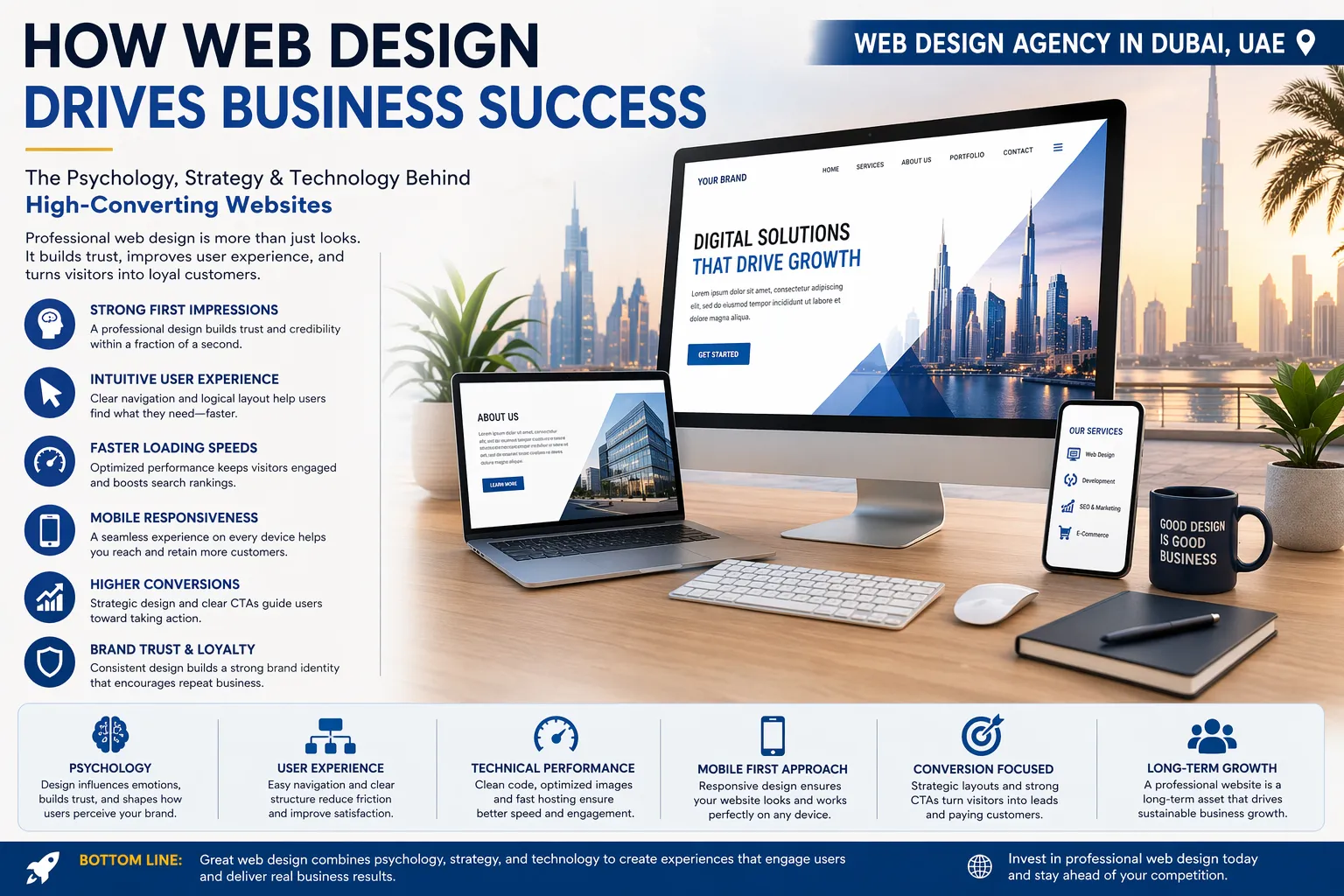
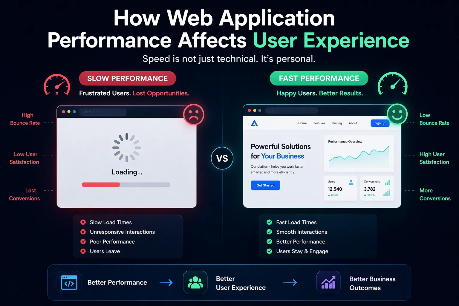
How Good Design Directly Affects Performance Metrics
This is where the conversation becomes very concrete for anyone running a business online.
Bounce rate, the percentage of visitors who leave after viewing only one page, drops significantly when navigation is clear and the page answers the visitor's question quickly. Time on site increases when content is presented in a way that guides the eye naturally rather than overwhelming it. Conversion rate, the metric most businesses actually care about, responds directly to how friction-free the path to action feels.
These are not soft benefits. They show up in the numbers, and they compound over time as more traffic flows through a better optimised experience.
A good web design agency in Dubai approaches every project with both dimensions in mind from the very first conversation. Do not design first and functionality later. Not functionality first, with design applied on top. Both together, informed by how real users actually behave rather than how designers imagine they might.
The Mobile Experience Is Where Most Websites Quietly Fail
Over sixty per cent of web traffic now comes from mobile devices. That statistic has been true for several years, and yet the number of websites that treat mobile as a secondary consideration remains surprisingly high.
Designing for mobile is not the same as making a desktop site smaller. The interaction patterns are different. Thumbs navigate differently from mouse cursors. Text that reads comfortably on a monitor becomes exhausting on a phone screen. Buttons that seem adequately sized on a desktop are genuinely difficult to tap accurately on a small touchscreen.
The best performing websites are designed mobile first, meaning the mobile experience is treated as the primary version rather than an adaptation of something built for larger screens.
What Separates a Good Website from One That Actually Performs
Honestly, the gap between a website that looks fine and one that genuinely performs comes down to intentionality. Every element on a high-performing site is there for a reason. The placement of the call to action button, the length of the headline, and the amount of white space around a form none of it is accidental.
That level of intentionality requires someone who understands both design and human behaviour. Any experienced best web design agency in Dubai will tell you that the research and thinking that happens before a single visual is created is often what determines whether the final product actually works in the real world.
The government website I mentioned at the start almost certainly had a design team involved at some point. What it was missing was someone asking the right questions about how a real person would actually try to use it.
That question is where good UX begins. And it makes all the difference.


Sign in to leave a comment.