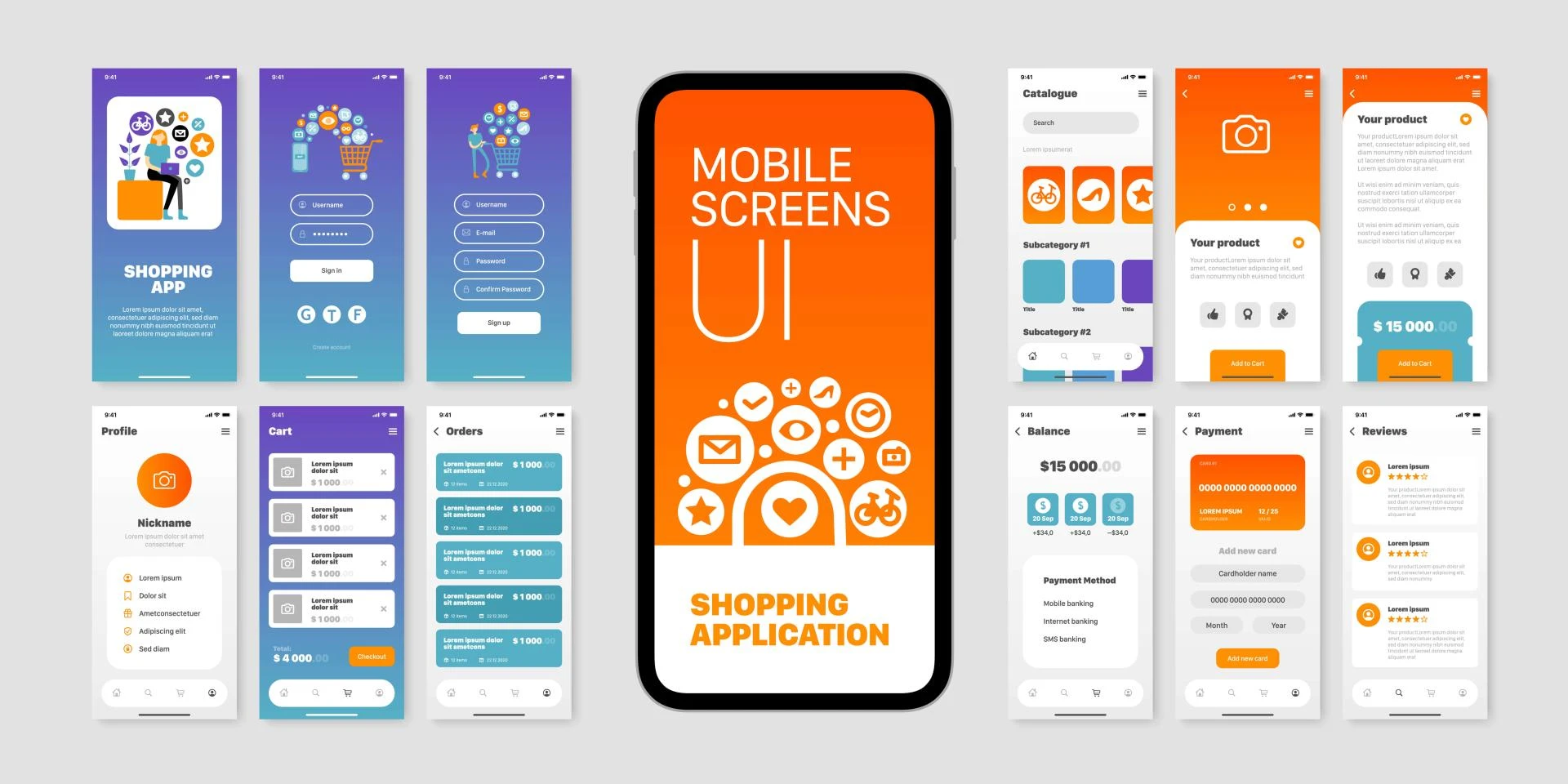
Mobile user interfaces (UI) have undergone a remarkable transformation since the advent of smartphones. This evolution reflects not only technological advancements but also changing user preferences and design philosophies. Let's explore the journey of mobile UI design, from the early days of skeuomorphism to the rise of flat design and beyond.
The Era of Skeuomorphism
When smartphones first entered the mainstream market in the late 2000s, designers faced a unique challenge: how to make these new digital interfaces intuitive for users accustomed to physical objects. The solution was skeuomorphism, a design approach that mimics real-world objects in digital interfaces.
Skeuomorphic design used visual cues from physical objects to help users understand digital functions. For example, a note-taking app might look like a yellow legal pad, complete with lined paper and a leather binding. Calendar apps resembled physical desktop calendars, and the iconic "save" icon was a floppy disk – an object many younger users had never actually seen in real life.
Apple was a prominent champion of skeuomorphism, particularly under Steve Jobs' leadership. The early versions of iOS featured realistic textures, shadows, and bevels that made icons and interface elements appear three-dimensional. This approach helped users transition from physical buttons and interfaces to touchscreens, making the new technology feel familiar and less intimidating.
The benefits of skeuomorphism were clear: it provided instant recognition and a sense of familiarity for users new to touch interfaces. However, as users became more comfortable with mobile devices, the limitations of skeuomorphic design became apparent. The realistic designs often resulted in cluttered interfaces and could limit functionality to maintain the real-world metaphor.
The Shift to Flat Design
As users grew more tech-savvy and mobile devices became ubiquitous, a new design philosophy emerged: flat design. This minimalist approach stripped away the textures, shadows, and 3D effects of skeuomorphism in favor of simple, two-dimensional elements.
Microsoft was an early adopter of flat design with the introduction of the Metro UI in Windows Phone 7 in 2010. This bold move set the stage for a broader shift in the industry. Apple followed suit in 2013 with the release of iOS 7, marking a dramatic departure from its previously skeuomorphic interface.
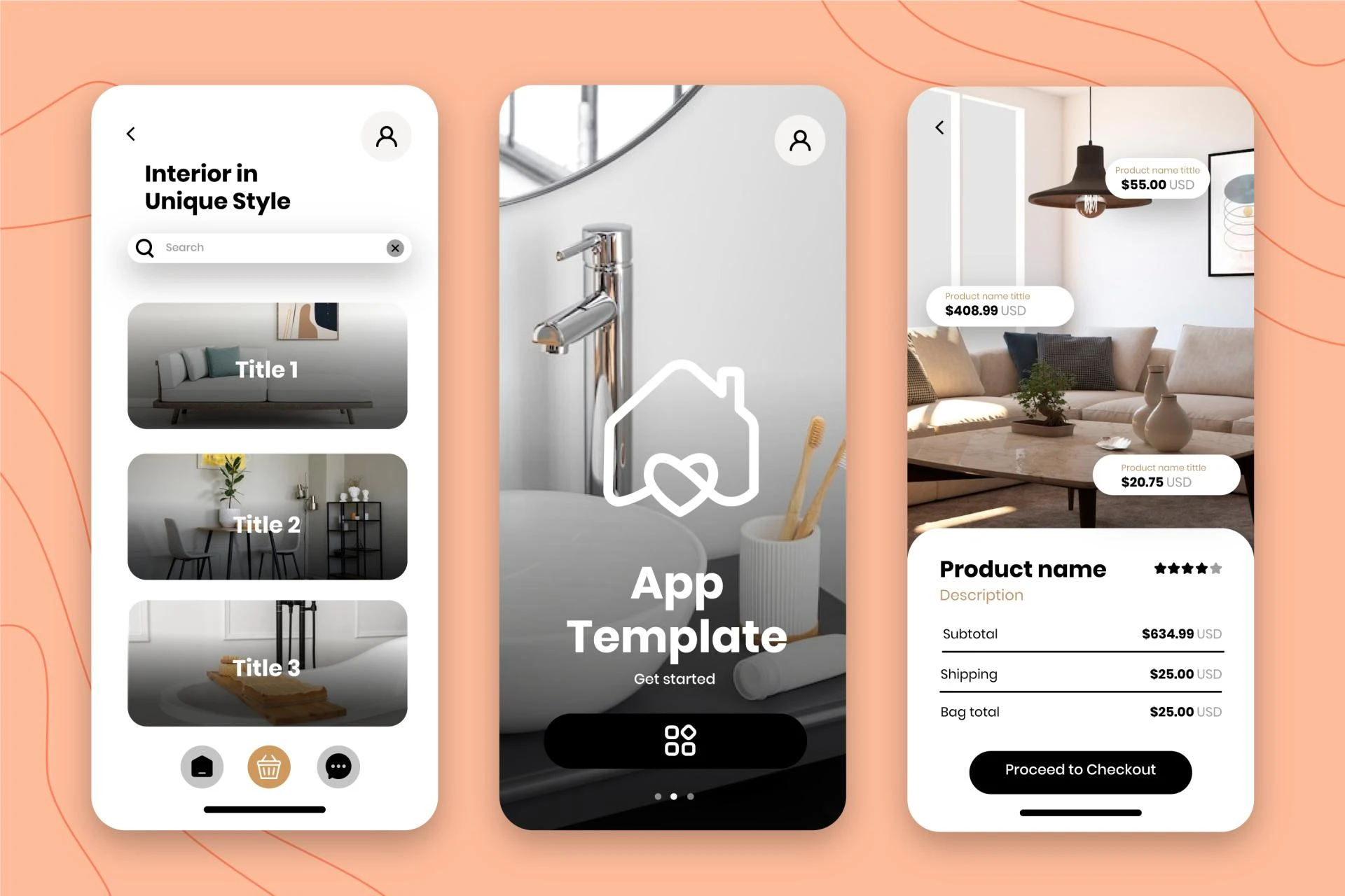
Flat design embraced simplicity, using solid colors, crisp edges, and simple icons. This approach offered several advantages:
Improved readability and clarity, especially on smaller screens Faster load times due to simpler graphics Easier scalability across different screen sizes and resolutions A more modern, clean aesthetic that felt fresh and innovativeThe flat design era also coincided with the rise of responsive web design, as designers sought to create interfaces that could adapt seamlessly across various devices and screen sizes.
Material Design: Google's Middle Ground
In 2014, Google introduced Material Design, a design language that aimed to blend the best aspects of skeuomorphism and flat design. Material Design retained the simplicity and cleanness of flat design but reintroduced subtle shadows, layering, and animation to create a sense of depth and hierarchy.
The key principles of Material Design included:
A paper and ink metaphor, suggesting that interface elements existed in a physical space Bold, graphic, and intentional use of color and imagery Meaningful animation to provide feedback and guide user attention Adaptive design that works across different platforms and screen sizesMaterial Design quickly gained popularity, influencing not only Android apps but also web design and even some iOS applications. It demonstrated that a middle ground between the extremes of skeuomorphism and flat design could offer both familiarity and modernity.
The Rise of Neumorphism
As designers continued to experiment and push boundaries, a new trend emerged around 2019: neumorphism (or neo-skeuomorphism). This style attempted to combine the depth and realism of skeuomorphism with the simplicity of flat design.
Neumorphic designs typically feature soft, extruded shapes that appear to push through the background, creating a subtle 3D effect. This is often achieved through the careful use of highlights and shadows, giving elements a embossed or debossed look.
While visually striking, neumorphism has faced criticism for potential accessibility issues, particularly in terms of contrast and usability for users with visual impairments. As a result, it has remained more of a niche trend rather than becoming widely adopted in mainstream UI design.
Current Trends and Future Directions
Today's mobile UI design landscape is diverse and continually evolving. While flat design principles still dominate, designers are increasingly incorporating elements that add depth, motion, and personality to interfaces. Some current trends include:
Microinteractions: Small, engaging animations that provide feedback and enhance the user experience.Dark mode: Offering users the option to switch to a dark color scheme, which can reduce eye strain and save battery life on OLED screens.
Glassmorphism: Using frosted glass-like effects to create a sense of depth and hierarchy in the interface.
3D elements: Incorporating three-dimensional objects and illustrations to add visual interest and depth.
Voice user interfaces (VUI): Integrating voice commands and interactions alongside traditional touch interfaces.
Augmented reality (AR) integration: Blending digital interfaces with the real world through smartphone cameras.
Looking to the future, we can expect mobile UI design to continue evolving in response to technological advancements and changing user needs. Some potential directions include:
More personalized interfaces that adapt to individual user preferences and behaviors.Increased use of AI and machine learning to create smarter, more intuitive UIs.
Further integration of gesture-based interactions, reducing reliance on traditional buttons and menus.
Exploration of new interface paradigms for emerging technologies like foldable phones, wearables, and mixed reality devices.
Conclusion
The evolution of mobile UI design from skeuomorphism to flat design and beyond reflects the rapid pace of technological change and our growing comfort with digital interfaces. Each stage in this journey has brought valuable insights and innovations, shaping the way we interact with our devices.
As we look to the future, the most successful mobile UI designs will likely continue to balance aesthetics with functionality, embracing new technologies while remaining intuitive and accessible to users. The ongoing challenge for designers will be to create interfaces that are not only visually appealing but also enhance productivity, engagement, and overall user satisfaction in an increasingly digital world.
Devoq Design is a renowned UI/UX Design Agency in Maryland, offering top-notch design services tailored to meet the unique needs of businesses across various industries. With a commitment to excellence, Devoq Design also extends its expertise as a leading UI/UX Design Agency in Massachusetts, providing innovative and user-centric solutions. Their team of skilled designers focuses on creating intuitive, engaging, and aesthetically pleasing digital experiences that drive user satisfaction and business success. Whether in Maryland or Massachusetts, Devoq Design stands out for its dedication to delivering high-quality design projects that resonate with users and achieve client goals.


Sign in to leave a comment.