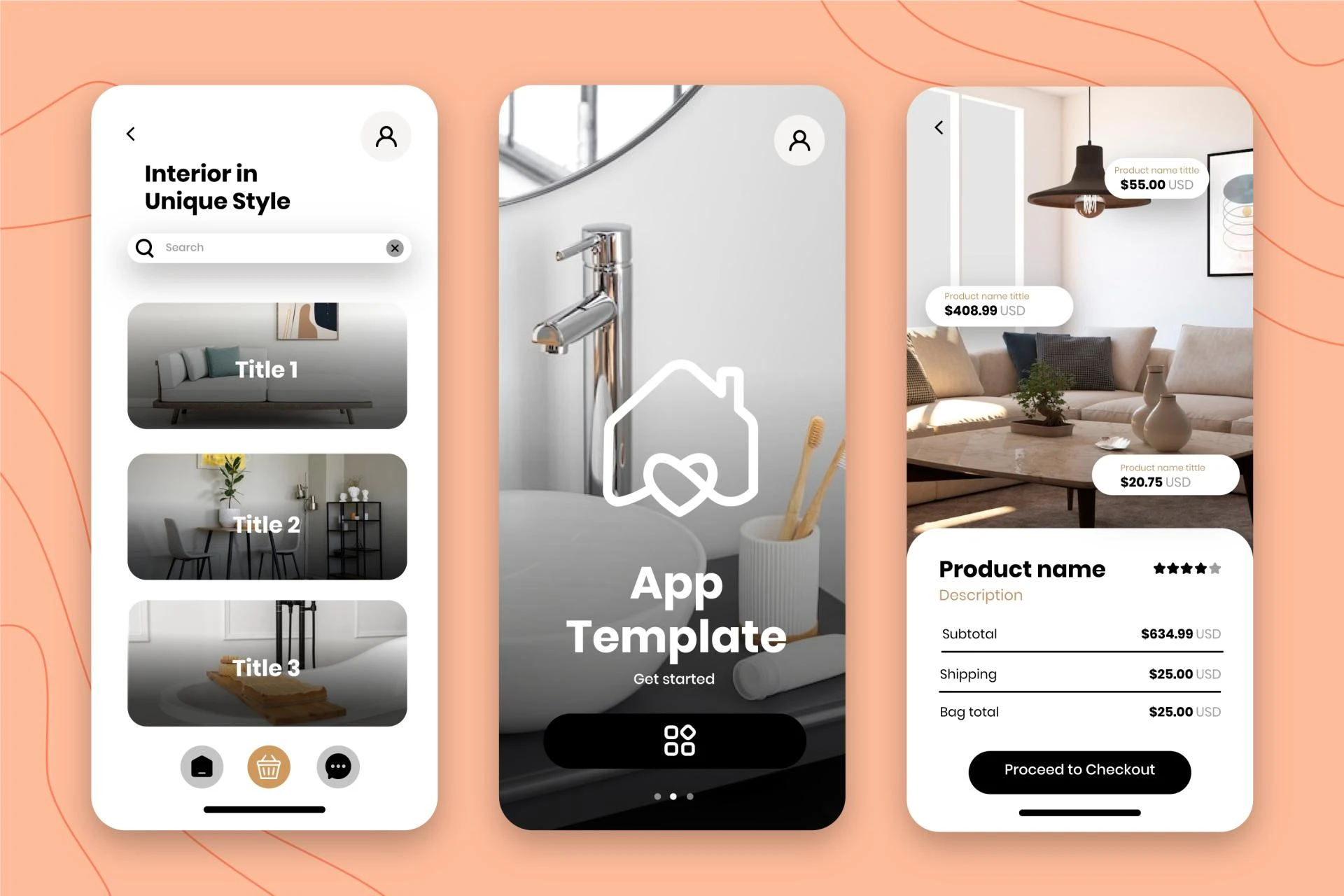
In the digital age, landing pages serve as the virtual storefronts of businesses, products, and services. These carefully crafted web pages are designed with a single goal in mind: to convert visitors into customers or leads. But what makes a landing page truly effective? The answer lies in understanding the psychology behind user interface (UI) and user experience (UX) design, and how these elements influence user behavior and decision-making processes.
The Power of First Impressions
Just as in face-to-face interactions, first impressions matter immensely in the digital world. Research shows that users form an opinion about a website within 50 milliseconds of landing on a page. This snap judgment can determine whether a visitor stays to explore further or bounces away to a competitor's site.
To create a positive first impression, designers focus on:
Visual Appeal: Clean, aesthetically pleasing designs that align with the brand's identity Clarity: Immediately communicating the page's purpose and value proposition Professionalism: Establishing credibility through high-quality imagery and polished designThe Psychology of Color
Colors evoke emotions and associations that can significantly impact user behavior. For example:
- Blue often conveys trust and stability, making it a popular choice for financial institutions and tech companies.
- Red can create a sense of urgency or excitement, often used for sales or limited-time offers.
- Green is associated with growth and nature, frequently employed by environmental or health-focused brands.
Understanding color psychology allows designers to create emotional connections with users and guide their actions on the landing page.
The F-Pattern and Z-Pattern of Eye Movement
Eye-tracking studies have revealed that users typically scan web pages in either an F-pattern or Z-pattern. The F-pattern is common for text-heavy pages, where users scan the top horizontal line, then move down the left side of the page, occasionally scanning right.
The Z-pattern is more common for pages with less text and more visual elements. Users start at the top-left, move horizontally to the right, then diagonally down to the left, and finally horizontally right again.
Designers leverage these patterns to strategically place important elements like headlines, calls-to-action (CTAs), and key benefits where users are most likely to see them.
The Principle of Least Effort
Humans naturally gravitate towards the path of least resistance. In UI/UX design, this translates to creating intuitive layouts and easy-to-use interfaces. Simplifying user journeys and reducing cognitive load can significantly increase conversion rates.
Strategies to reduce effort include:
- Clear navigation structures
- Concise and scannable content
- Minimizing form fields
- Providing autocomplete options
The Paradox of Choice
While offering options seems beneficial, too many choices can lead to decision paralysis. Psychologist Barry Schwartz's "Paradox of Choice" theory suggests that an abundance of options can actually decrease satisfaction and increase anxiety.
On landing pages, this principle is applied by:
- Limiting the number of product variations or service tiers
- Focusing on a single, clear CTA
- Highlighting a recommended or popular option
Social Proof and Herd Behavior
Humans are social creatures who often look to others for guidance on how to behave. This psychological tendency is leveraged on landing pages through:
- Customer testimonials
- User reviews
- Logos of well-known clients
- Social media follower counts
By showcasing social proof, landing pages tap into the user's desire to conform and make decisions based on the actions of others.
The Scarcity Principle
The fear of missing out (FOMO) is a powerful motivator. When something is perceived as scarce or limited, its perceived value increases. Landing pages often employ this principle through:
- Limited-time offers
- Countdown timers
- Low stock warnings
- Exclusive or limited edition products
These tactics create a sense of urgency, prompting users to take immediate action.
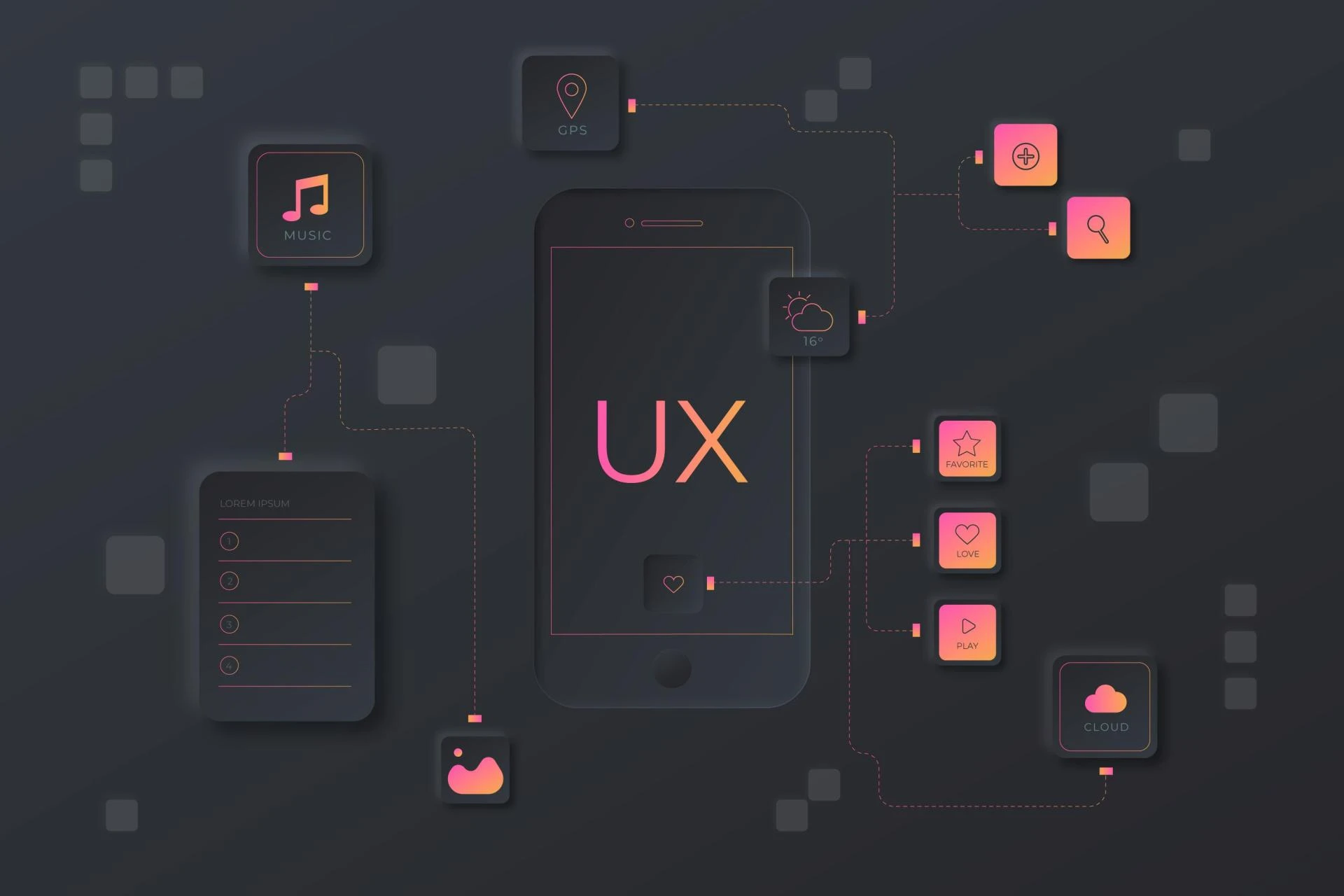
Visual Hierarchy and Information Processing
The human brain processes visual information 60,000 times faster than text. Effective landing pages use visual hierarchy to guide users' attention and help them quickly understand the most important information.
Key elements of visual hierarchy include:
- Size and scale of elements
- Color contrast
- White space
- Directional cues (like arrows or images of people looking at important content)
By carefully structuring these elements, designers can create a visual pathway that leads users towards the desired action.
The Power of Storytelling
Humans are wired to respond to stories. A well-crafted narrative can engage users emotionally and make complex information more digestible. On landing pages, storytelling can be implemented through:
- Before-and-after scenarios
- Customer success stories
- Product origin stories
- Visual narratives that guide users through the benefits of a product or service
The Reciprocity Principle
When we receive something, we feel compelled to give something in return. Landing pages often use this principle by offering free valuable content (e.g., ebooks, webinars, or trials) in exchange for user information or engagement.
The Anchoring Effect
The anchoring effect describes the tendency to rely heavily on the first piece of information encountered when making decisions. In landing page design, this can be used by:
- Presenting a higher-priced option first, making subsequent options seem more reasonable
- Highlighting the original price before showing a discounted price
- Using comparative pricing to anchor the value of the offer
The Role of Trust and Credibility
Building trust is crucial for converting visitors into customers. Landing pages establish credibility through:
- Security badges and certifications
- Clear privacy policies
- Professional design and error-free content
- Transparency about product features, pricing, and terms
Cognitive Fluency
The easier information is to process, the more likely it is to be perceived as true and favorable. This concept, known as cognitive fluency, is applied to landing pages by:
- Using clear, simple language
- Breaking content into easily digestible chunks
- Using familiar design patterns and layouts
- Ensuring fast page load times
Conclusion
The psychology behind UI/UX landing page design is a fascinating blend of visual perception, cognitive processing, and behavioral economics. By understanding and applying these psychological principles, designers can create landing pages that not only look great but also effectively guide user behavior and decision-making.
However, it's important to remember that while these principles provide a solid foundation, every audience is unique. Continuous testing and optimization are crucial to refine designs and ensure they resonate with the specific target audience.
As technology evolves and user expectations change, the field of UI/UX design will continue to adapt. Staying informed about the latest research in cognitive psychology and user behavior will be key to creating landing pages that not only convert but also provide genuine value to users in their decision-making journey.
My Fiver link for : Figma Landing Page Design Service


Sign in to leave a comment.