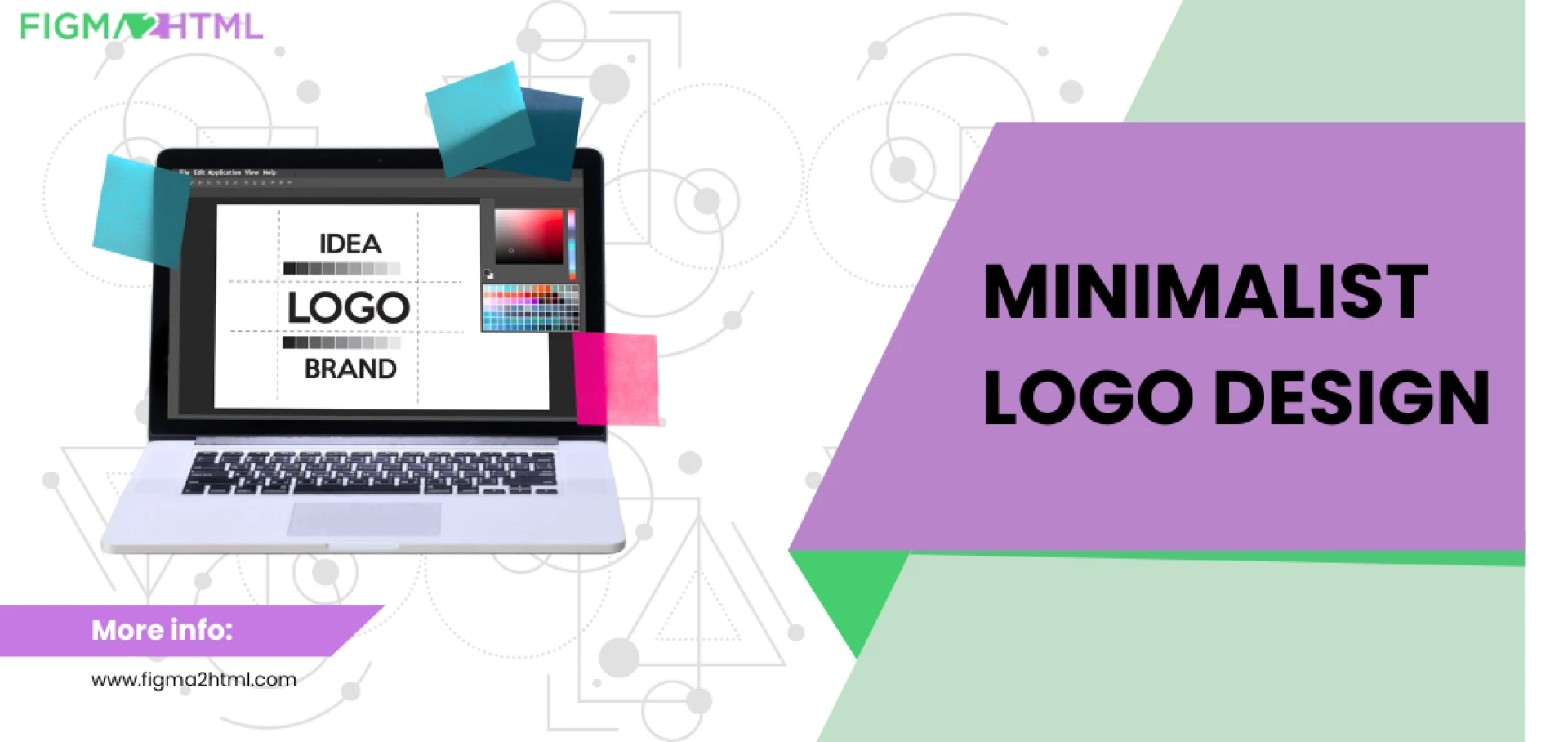
Minimalist logo design has become a dominant trend in branding, with its clean lines, simple typography, and impactful presence. Over the years, logo design has evolved from intricate, detailed illustrations to sleek, minimalistic designs that convey brand identity in a refined manner. This article explores the journey of minimalist logo design, its historical significance, modern adaptations, and the importance of choosing a minimalist logo design service for a strong brand identity.
The Roots of Minimalist Logo Design
Early Branding and Logos
Logos have existed for centuries, evolving from ancient symbols and emblems to sophisticated brand marks. The earliest forms of branding can be traced back to:
- Ancient Egyptian Hieroglyphs: Symbols used for identity and communication.
- Medieval Heraldry: Family crests and emblems that signified status and power.
- Industrial Revolution: The rise of mass production required businesses to develop recognizable logos for their products.
The Birth of Modern Logo Design
In the early 20th century, logos became an essential part of corporate branding. Companies began shifting from ornate, complex designs to simple, recognizable symbols. This shift was largely influenced by:
- The Bauhaus Movement (1919-1933): Advocated for functionality and simplicity in design.
- Swiss Design Movement (1950s-1960s): Emphasized clean typography and grid-based layouts.
- Corporate Identity Boom (1960s-1980s): Companies like IBM, NASA, and American Airlines adopted simple yet powerful logos.
The Rise of Minimalist Logo Design
Minimalist logo design started gaining traction in the late 20th and early 21st centuries. Brands realized that simplicity enhanced memorability and brand recognition. The shift towards minimalist logo design can be attributed to:
1. The Digital Revolution
With the rise of the internet and mobile devices, logos needed to be adaptable across multiple platforms. Minimalist designs proved to be:
- Scalable: Easily recognizable across different screen sizes.
- Versatile: Works well in monochrome and various backgrounds.
- Timeless: Avoids design trends that may become outdated.
2. Consumer Preference for Simplicity
Modern consumers prefer brands that offer clarity and direct messaging. A minimalist logo design eliminates clutter and communicates a brand’s identity effectively.
3. Iconic Brands Leading the Trend
Many global brands transitioned to minimalist logos, reinforcing the power of simplicity:
- Apple (1977 – Present): Evolved from a detailed illustration of Isaac Newton to the iconic apple silhouette.
- Nike (1971 – Present): The swoosh remains one of the most recognizable minimalist logos.
- Google (2015 Redesign): Simplified its serif logo into a clean, sans-serif wordmark.
Key Elements of Minimalist Logo Design
Minimalist logos focus on essential design elements while removing unnecessary details. The core principles include:
1. Simplicity
A minimalist logo eliminates excess detail, allowing for easy recognition and memorability.
2. Clean Typography
Sans-serif fonts are commonly used in minimalist logo design for their readability and modern appeal. Examples include:
- Helvetica
- Futura
- Gotham
3. Strategic Use of Colors
Minimalist logos often utilize monochromatic or limited color palettes to create a sleek and professional look. Popular choices include:
- Black and white for timeless appeal.
- Muted tones for sophistication.
- Bright accents for modern aesthetics.
4. Negative Space
Negative space plays a crucial role in minimalist logo design, creating hidden meanings and enhancing visual balance. Examples include:
- FedEx: The hidden arrow within the typography.
- Amazon: The smile-shaped arrow connecting A to Z.
5. Geometric Shapes
Simple geometric shapes add symmetry and visual balance, making logos more impactful and recognizable.
The Shift from Classic to Contemporary Minimalist Logo Design
As design trends evolve, minimalist logos continue to adapt to modern aesthetics while retaining their simplicity. Here’s how:
1. Classic Minimalist Logo Design (1980s-2000s)
- Flat designs with clear typography.
- Emphasis on monochromatic palettes.
- Traditional branding elements with slight modifications.
- Example: The original Google logo featured primary colors but transitioned into a sleeker form over time.
2. Contemporary Minimalist Logo Design (2010-Present)
- More refined and abstract logos.
- Bolder, custom typography.
- Gradient and subtle textures for depth.
- Example: Instagram's transition from a detailed camera icon to a simplified, vibrant gradient.
Why Choose a Minimalist Logo Design Service?
While minimalist logos look simple, achieving the perfect balance of form and function requires expertise. Hiring a minimalist logo design service ensures:
1. Professional Quality
Designers understand the nuances of typography, color theory, and brand strategy, ensuring a high-quality, impactful logo.
2. Customization
A minimalist logo design service tailors the logo to align with your brand identity rather than relying on generic templates.
3. Scalability & Versatility
Professionally designed logos maintain visual integrity across print, digital, and mobile platforms.
4. Competitive Edge
A well-crafted minimalist logo sets your brand apart, making it more memorable and engaging for your audience.
Future Trends in Minimalist Logo Design
Minimalist logo design continues to evolve, with new trends shaping the future of branding.
1. Animated Minimalist Logos
Subtle motion graphics enhance engagement while maintaining simplicity.
2. AI-Generated Logos
AI tools assist designers in creating minimalist logo designs efficiently.
3. Eco-Friendly & Sustainable Design
Brands are incorporating nature-inspired elements into minimalist logos to align with sustainability efforts.
4. Adaptive Logos
Logos that adjust based on screen sizes and devices without losing their essence.
Conclusion
The journey of minimalist logo design from classic to contemporary highlights its effectiveness in modern branding. Whether you're a startup or an established brand, a minimalist logo ensures clarity, versatility, and lasting impact. Investing in a minimalist logo design service guarantees a professionally crafted logo that resonates with your target audience.


Sign in to leave a comment.